One of the themes of this May’s #RomBkLove series on Twitter was covers. Whether I am at an author event live or just chatting online, the feedback I hear most often about my books is how much people like the covers. If that sounds like a brag, you should know that I do not design my covers. I have some input—more than a traditionally-published author has, probably—but the real credit goes to the unsung hero of Little Brick Books Publishing, Mr. Hallock. (A former professional photojournalist and now a ghostwriter for a consulting firm, Mr. H is also one of my editors, as well as my marketing advisor, business manager, and accountant. We are still happily married, a modern day miracle.)
But we’re here to talk about covers, so let’s get started. I’m going to be giving the inside scoop here, which I hope doesn’t detract from the magic of the final product. Given how many people are choosing to self-publish these days, I thought a little transparency might be helpful. All images were purchased from Shutterstock.
Disclaimer: Always defer to your designer’s technical and professional judgments, as this post is not a step-by-step how-to. Even Mr. H knows not to bow the author’s every whim. The cover is not totally about the book, remember: it needs to project the genre, mood, and theme. For me that meant:
- Genre: cross between historical romance and historical fiction
- Mood: politically and emotionally charged, with explicit sex
- Theme: heavy themes (e.g. war, colonial policy, PTSD, and more)
I am not qualified to instruct you comprehensively on design elements, but here’s another piece of advice: the cover must scan well and read clearly as a thumbnail. Okay, so here goes a short tale of four covers:
Under the Sugar Sun
 When we first started this venture, we had some ideas of creating virtual three-dimensional images of dresses, but the technology in 2015 just wasn’t there yet—nor was our expertise. So we started looking at stock images. Since the heroine of Under the Sugar Sun has red hair, I built a collection of redheaded women in vintage (or retro) dress styles. We were paging through them together when Mr. H stopped on the image above. “Easy,” he said.
Easy, I wondered? I loved her hair and the corset, but nothing about the original surroundings of the model was what I wanted. (What kind of bedspread is that, by the way?) But the very next day, Mr. H showed me the crop that would become the cover, including the blacked out background. Instantly, I was excited. Yes, the hooks in the corset are not really true to period, even if you keep in mind that my period is 1902 not 1814. Moreover, my character never wears a corset in the book . . . but never mind! You cannot be too literal, remember.
“So,” you ask, “what did you do to make this cover happen, Jen?” Not much. I did choose the title font, which has become the signature of the Sugar Sun series (which is why I am not naming it here). I searched through font after font, typing in “Under the Sugar Sun” in generators to see what (a) looked turn-of-the-century and (b) struck the right balance of stylistic elements and readability. Mr. H was not sold at first, but he ultimately agreed. A cover was born.
Hotel oriente
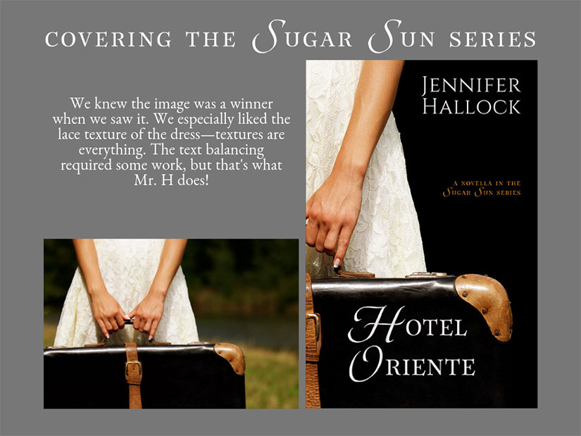
We knew this image was a winner when we saw it. It had one of the key attributes Mr. H looks for: texture in the lace of the dress. Colors are important, but textures are best because they give the image a story within a story. The cropping left a challenge for text spaces, which Mr. H solved by inverting title and author name. This is the only book in the series (so far?) that has author name at the top, not bottom—and I love it.
Tempting Hymn
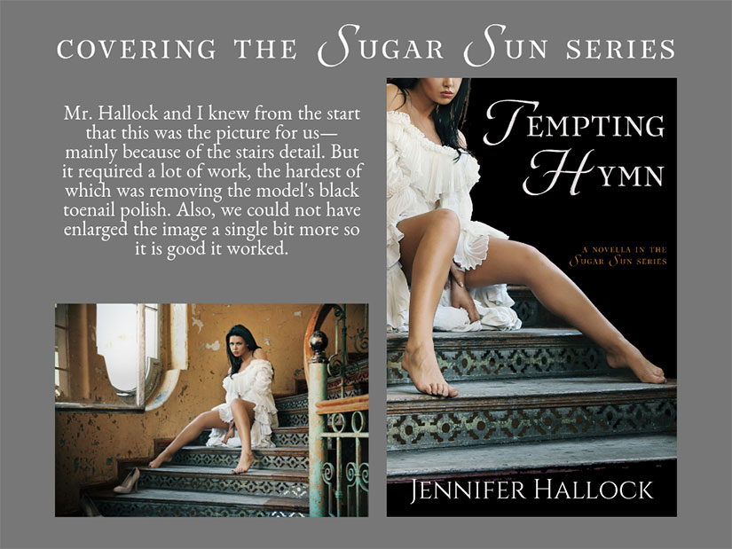 Tempting Hymn had to be a little sultry, though not because Rosa is the temptress she is accused of being. With a title like this one—and a story centered on two people of faith who sing in a choir together, complete with chapter titles from those hymns—this book needs a little sex upfront to warn readers of inspirational romance that this isn’t one. I have no problem with closed-door romance; I just do not write it. This book is open-door. Wide. Open. Door. (I am not afraid of bad reviews on this score. A review saying there is too much sex in a book is pretty much the best kind of negative review to get. However, I do not wish to make people unnecessarily uncomfortable.) Mr. Hallock had to do a lot of work to make this a cover—see the above note about nail polish—but I love it.
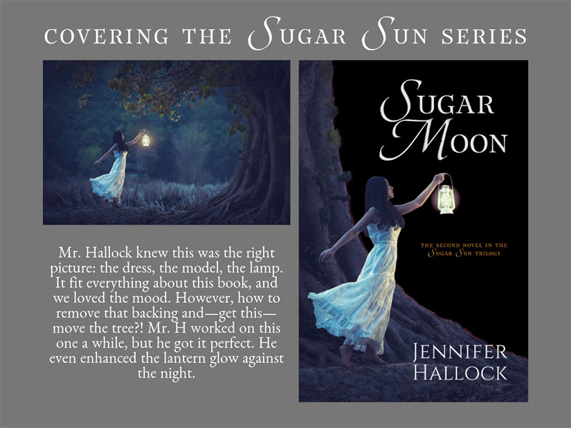
Sugar Moon
It took a really long time to find this photo. A really long time. Not quite as long as it took to write Sugar Moon, but honestly almost. I did not want to compromise this time by cutting off the face of a non-Asian model. In fact, I wanted a Southeast Asian model in (potential) period dress, which was as picky as I thought that I could be. Mr. H and I both loved the image right from the start, but it took my husband’s expertise to make it the cover you see above. I’m all heart eyes. It is my favorite so far, and that is saying something because I do love them all.
Thank you, Mr. Hallock!
